CCEI Energy use
Interactive data visualization
Description
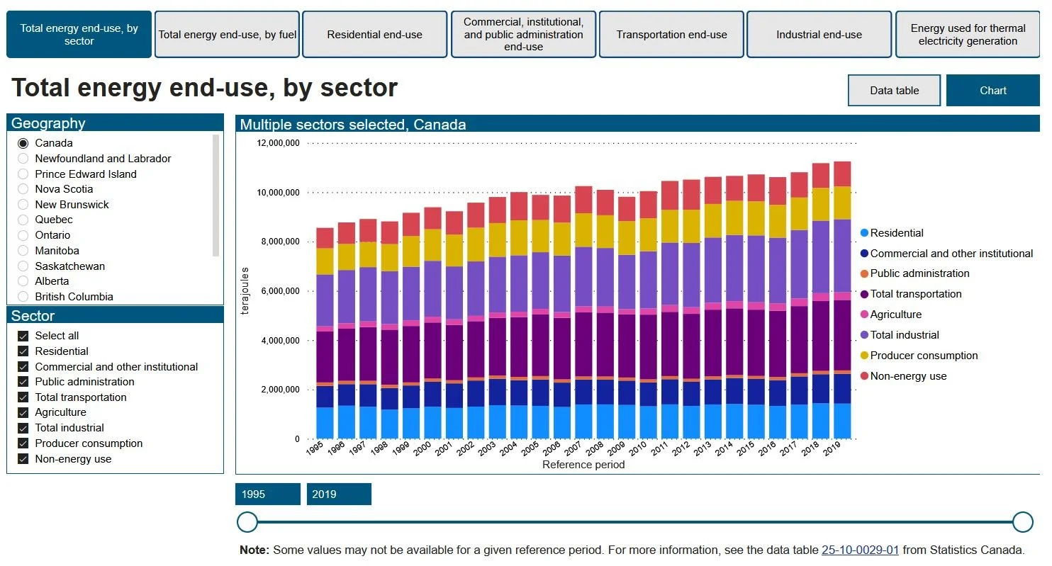
This product displays the overall energy use of various sectors across the country. The user is able to select different types of energy in order to compare them with each other. Each tab has a stacked bar chart or line chart in relation to a major industry where their energy consumption is shown for the last twenty years.
-
Published in 2021
-
Completed
-
Visual Designer
Interaction Designer
Developer
-
Project manager
Subject matter expert
Analyst
Designer
Developer
-
Canadian Centre for Energy Information (CCEI)
Technology
The following technology was used to develop the application.
Microsoft Power BI Service for publishing the dashboard
Power BI to develop the application
DAX for internal data analysis
Constraints
Throughout the design and development of this product, there were a few constraints to consider.
Large amount of data
Existing brand identity (predefined colors and style)
Numerous energy types
Bilingual dashboard (English and French)
User flow
The user flow was defined early in the design process. We decided to give the user an explorative approach in the application. It will allow the user to select different industries without forcing them to follow a straight path.
As a result, we found this is best suitable for the general public. They won’t have specific limitations in terms of interactions. It will give them the freedom of choice of tabs to explore.
Seven tabs are presented to the users with their specific functionality.
Interactions
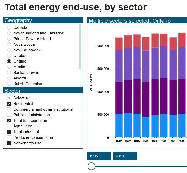
Users create their custom selections by defining a specific geography, choosing multiple sector(s) and configuring the reference period. They personalize these filters to their needs. It gives them more flexibility of exploration.
Exploring the data
Throughout the development of the application, I was able to create an ETL (Extract, transform and load) workflow which would enhance the data update process at any given time.
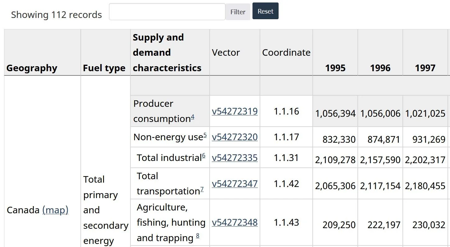
I accomplished this task by connecting the app to the Statistics Canada API. I had to extract only the relevant information. Afterwards, I transformed the data to the correct data types, renamed and removed incorrect data points. The last step was to load the information into the application for data analysis.
Data source
The data analysis was straightforward since Power BI has default features for general purpose calculations.
Here are a few important elements integrated:
Filtered information by geographies and energy types
Categorized the data by year
Dynamically calculated totals for each year
Added option to select all energy types


